Susan’s December 2018 Newsletter Tutorial

DO YOU EVER SAY TO YOURSELF “There is something wrong with this painting, but I’m not sure what it is”?
It is a common problem and the great news is that it’s often easy to fix. I am about to reveal how to identify the problem and how to remedy it quickly.
A COLOR THAT IS OUT OF PLACE CAN HAVE A DRAMATIC IMPACT ON THE SUCCESS OF A PAINTING.
In my international workshops and teaching I find by far and away the most common issue is to do with a color looking out of place. Often we don’t realize it – but such a color can throw the whole painting out of kilter.
How do we identify it?
It doesn’t always jump out at us. We can look at a painting and know something is wrong – but without understanding this simple glitch – we can struggle to see where the problem lies. In my teaching I find a simple phrase is easy for artists to recall:
“If a color looks wrong – it is often not the color that is wrong – it is the color temperature”
You might like to place these words at the top of your trouble-shooting check list or in your ‘wise painting words tool box’ for future use.
Let me explain what I mean:
When something ‘feels’ wrong – the first thing to do is to narrow down the area that seems incongruous with the rest of your painting. Generally I find it appears to be a color that can be subtly wrong – or maybe it is screaming “Mud” or “Out of place”. In most cases it’s not the ‘color’ that is wrong – it’s the ‘color temperature’ that is out of kilter with the surrounding colors. It is so easy to fix! But first let’s talk about WHY the color ‘looks wrong’.
I generally find a ‘wrong color’ is a color that is too cool in color temperature for it to sit comfortably amongst the surrounding area. ‘Too cool’ generally means there is too much blue in the mix.
THE REMEDY IS EASY!
Simply warm it up with more yellow, orange or red! We need to lessen the effect of blue that has dominated the mix and/or the area.
If you have a ‘muddy’ looking color, a simple transparent wash or glaze of a warmer transparent or semi-transparent color/mix over top can work miracles!!!

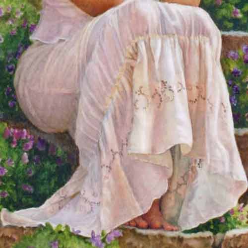
‘Time for Reflection’ – Watercolor on Arches 140lbs (300gsm) Hot Pressed Paper
Take a look at how I have been able to achieve fresh, clean, natural-looking shadow colors in the skirt fabric in this serene watercolor study. (Click on the image to enlarge it).
‘Time for Reflection’ cropped
Close up of shadow colors. Can you see how the beautiful, clean, delicate warm shadow colors look natural and harmonious? The warm colors appear to dance on the paper don’t they? (Click on the image to enlarge it).

Close up of shadow colors, some of which I have deliberately made ‘too cool’. I did this using Adobe Photoshop, however I could have achieved this same ‘muddy’ effect if I used too much blue in my shadow mixes. This is a great example of how an incongruous, cool mix of shadow colors can bring a ‘muddy’ feel – a sense of being ‘out of place’ amongst the fresh, clean colors I have used elsewhere. I have used a cool grey shadow color instead of a beautiful clean warm shadow color. Can you see how the cool grey shadow colors in the front of the skirt look dull and lifeless? Even though your actual grey mix may be transparent and clean – the effect of using a very cool shadow color can often give a ‘muddy’ appearance because it is far too cool for the surrounding areas – which are warmer. They are OK, but we can do better than ‘OK’ can’t we? We want our paintings to captivate the viewer and allow them to feel the warmth of the shadows as they bounce around within the folds of the skirt. How rich and warm you make them is personal preference. I love to use artistic license to emphasize the message I want my paintings to carry!
In Summary:
If I find any color that looks ‘wrong’, ‘muddy’ or ‘out of place’ – the best thing to do is simply add a warm color wash (watercolor) or glaze (oil) over the top to ‘tweak’ the color to enable it to read ‘warmer’. Voila! Try it – you will be amazed at how effective this is.
TRANSPARENT COLOR VERSUS OPAQUE COLOR
TIP: True ‘muddy’ colors can also result from using two or more opaque colors in a mix. How can you tell if a color is opaque? You can generally find the transparency/opacity symbols on the pigment label on the tubes of your paints – or on the color chart.
On the right is a list of the symbols and their meaning:

Having said this – I must also reiterate that I generally find the problem is a color temperature issue as highlighted in this article. However do be mindful to limit opaque colors you use in a mix to no more than one, otherwise you run the risk of creating mud 🙂
ANOTHER EXAMPLE OF ‘MUDDY’ LOOKING COLORS VERSUS CLEAN, FRESH COLORS THAT DANCE IN OUR PAINTINGS
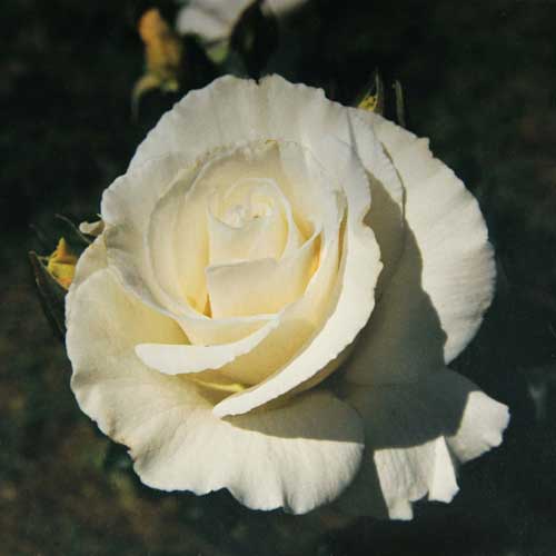
Reference photo of rose in the garden.
Can you see how the cool shadow colors in this photo look dull and lifeless? They say that photos never lie. I think all artists are aware this simply isn’t true. This photograph is a great example! It was the luscious warmth of the luminous glowing shadows within this rose that captivated and inspired me to paint her. The printed photograph looked markedly different as you can see. The warm luscious shadows are where the magic is. Portray this and you will find your painting will be so much more captivating! (Click on the image to enlarge it).
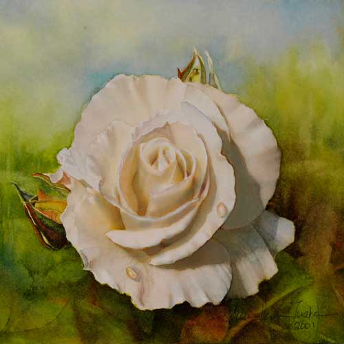
Watercolor painting altered to reflect coolness of the reference photo.
This image shows my original painting, but with the rose colors altered in Adobe Photoshop to reflect the cool colors of the reference photo. (Click on the image to enlarge it).
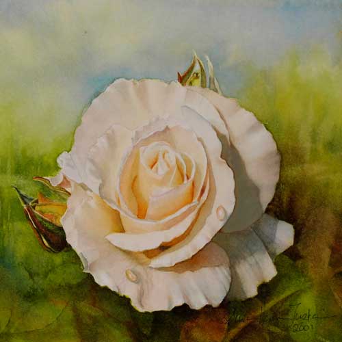
‘On Angels’ Wings’ Watercolor on Arches 140lbs (300gsm) Hot Pressed Paper.
Miniature painting.
These colors look harmonious. I often use artistic license to emphasize the ‘spirit’ of my painting. I wanted to capture the rich warmth of the sunlight bouncing within my rose. The colors dance on the paper and carry the joy of glowing shadow color which was what inspired me to paint this rose study. (Click on the image to enlarge it).
LEARNING ‘HOW’ AND ‘WHY’ THINGS WORK GIVES YOU A FAR-REACHING UNDERSTANDING THAT WILL EMPOWER YOU TO GREATER SUCCESS AND JOY ON THIS AMAZING PAINTING JOURNEY WE ARE ON.
My teaching philosophy is different. The most powerful and useful knowledge is the knowledge that allows you to understand ‘WHY’ something works or ‘WHY’ something doesn’t work. This is the key to learning and growing. In my teaching I specialize in helping artists to understand the logic behind ‘WHAT’ we do, ‘HOW’ we do it and ‘WHY’ we do it.
Learning to understand the logic behind what we see in nature – and how to create these things with our brushes and paint – brings an awareness and insight, all of which helps us to find our wings and to take a giant leap off the proverbial plateau that most of us find ourselves on at some stage in our painting journey.
It is my pleasure to help you find your wings too!
Happy painting everyone!
To return to my 2018 Newsletter please click HERE.
DVD’s and Video Downloads
Order Susan’s highly acclaimed and popular instruction DVD sets below.
-

DVD: Watercolor Masterclass Volume One: “Painting Life-Like Leaves and Vibrant Greens” – for all skill levels
US$54.50 -

One-on-One Watercolor Workshops with Susan Harrison-Tustain – for all skill levels
US$54.50 -

Painting Watercolor My Way with Susan Harrison-Tustain – for all skill levels
US$54.50 -

Watercolor Portrait Workshop with Susan Harrison-Tustain – for all skill levels
US$54.50
