My Colour Palettes
(Watercolor & Oil)

MY WATERCOLOR PALETTE
“Is this watercolour? It looks like oils it is so rich!” I am often asked what colours I use to create my luminous and transparent reality.
It is not a straightforward answer. But one of the main reasons my work looks as if the subject has a presence is because I use a multi-layered technique using transparent or semi-transparent watercolour.
Why?
Because they allow our paintings to glow. Think of several fine layers of colour, laid one on top of the other. Each one will be influenced by those laid beneath them. The final colour glows like a jewel because the colours are unsullied by opaque pigment.
I will share my magical palette of hues below. But first – let me explain a very important factor when choosing pigments: Not all hues are equal! The same names are often used by the colour houses for very different colours. They are not interchangeable. For instance Indian Yellow in one brand is very opaque – but in the brand I use – it is very transparent. Transparent colours are crucial in the success of unsullied colour using my methods.
Below are the 12 Schmincke Horadam Watercolours I use (with their Schmincke numbers). You can find where to purchase them on my ‘Art Materials’ page here:

TIP: A mix of Transparent Red Deep (355) + Ruby Red (351) will result in a beautiful rich staining alternative to the Alizarin Crimson I have used previously.
All 12 Schmincke colours are available in 5ml and great value 15ml tubes. These can be bought individually or for your convenience they are available in a Susan Harrison-Tustain signature set of pigments. This set of 12 x 5ml tubes is presented in a stylish black Japanned tin box with fold out mixing trays. You can find out more about it here: https://www.susanart.com/workshopslessons/signature-sets/
I have a few favorite mixes that I like to share on my Watercolor DVDs & Video Downloads and also with those on my workshops:
To create a gorgeous Sap Green:
Mix Sap Green with Transparent Orange = fabulous, clean, fresh and very transparent green.
To create a brilliant purple:
Phthalo Green and Purple Magenta = stunning clean purple ideal for floral studies.

How to create luminous Blacks that dance with luscious color:
I don’t ever use a tube black for watercolor. Why would I limit my choices to just a tube of black when we can mix the most beautiful blacks in a moment using a mix of Transparent Red Dark with Ruby Red, Phthalo Green and a touch of Phthalo Blue to create a luscious black.
The added bonus is that you can push your black (dark, darks) to favour red, green, blue, or neutral. Just simply allow one of the colors used in the mix to dominate the mixture. Or you can allow the mix to become neutral in color by not favouring any of those colors in particular. Easy!
You can see more on my highly recommended limited palette of 12 watercolors and where to purchase them on this page of my site:
Complementary colours:
-Blue/Orange
-Orange/Blue
-Red/Green
-Green/Red
-Purple/Yellow
-Yellow/Purple

By using transparent colours you will not create mud. You can create browns and earth colours that will resemble mud in hue – but they will always glow beautifully from within. My teaching methods and this limited palette of colours have been especially chosen after years of experimentation. They can be used to create any subject at all. If you wish to view a wide and very varied range of subjects painted using this palette please click on this link to the painting gallery on my website.
Watch this magical palette of colours bring paintings to life. See all the unique methods and techniques I use as you learn my innovative and invaluable lessons on how to mix colours, layer colours, lift, mould form, push-pull your subject to allow it to sit comfortably within the composition. This is touching on just a very few of the enormous number of lessons you will discover in my two-disc DVD sets and video downloads.
You will see how my methods and techniques along with this wonderful palette of colours will help you to create your own magic with confidence. You will find it is easy to adapt my methods and use my palette for any subject matter, surface or texture at all.
Try my palette and you will see what I mean.
Above all – have fun!
MY OIL PALETTE
The oil painting colors I use are made by Schmincke of Germany. The company’s motto is ‘Meliora Cogito’ – meaning “I strive for the Best”. I certainly find the Schmincke oil colors I use are the best for my purposes. My palette consists of 24 colors – 23 of them are in the Schmincke ‘Norma Professional Finest Artists’ Oil Colours’ range and 1 is in the Schmincke ‘Mussini Finest Artists’ Resin-Oil Colours’ range.
Schmincke Norma oil colours are beautiful to paint with. In addition, they are environmentally friendly in both their formulation and production. I trialed many brands but Schmincke Norma stood out from the crowd. I was prepared to use other brands, but the Norma range were the most beautiful to paint with. They flow well, they are nicely balanced with the right amount of oil to reduce the likelihood of those ‘sunken’ areas we so often see. The pigment is dense and rich.
The one colour I use from the pinnacle Schmincke Mussini range is Transparent Orange. I could not find such a luscious, vibrant and transparent orange elsewhere and it mixes beautifully with the colours in the Schmincke Norma range.
The 24 Colors in my Schmincke Oil Painting Palette:

TIP: Whenever I am painting I find that preparation is one of the keys to success. To prepare any oil paints for painting it is a great idea to place the colours around your palette, then knead each one for a minute or so with a palette knife. They become so buttery and luscious that they are a dream to use. This is a little like ‘creaming the butter and sugar’ when making a cake. This kneading is quick and easy to do.
The result is magical! Give it a try! I know you will love it too!
Instructional Art DVD’s and Video Downloads
Click on any of the DVD images below to find more in-depth information on the contents of each of the DVDs and Video Downloads.
-

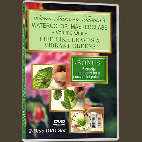
DVD: Watercolor Masterclass Volume One: “Painting Life-Like Leaves and Vibrant Greens” – for all skill levels
US$54.50 -

One-on-One Watercolor Workshops with Susan Harrison-Tustain – for all skill levels
US$54.50 -

Painting Watercolor My Way with Susan Harrison-Tustain – for all skill levels
US$54.50 -

Watercolor Portrait Workshop with Susan Harrison-Tustain – for all skill levels
US$54.50

