So what is it we want to say?
As an artist you will know the feeling you have when you are captivated by something. The overwhelming need to paint this particular subject and to share the excitement with the viewers of your work, is one of the most exciting elements of being an artist. But where to start? It doesn’t matter whether you are watercolor painting or oil painting. I can help you.
Okay – so we want a painting that is more than just a ‘pretty picture’- a wall decoration – right? How do we do this? Well, it begins with thought. There are two essential ingredients to this recipe:
1. Start with an analysis of what you see and what you feel about your subject. What is it about that which is in front of you, that makes you stop in your tracks? Is it the lighting, or the colors, the atmosphere/mood? Is it the abstract shapes, or the texture contrasts or is it something about the main subject that gives a nostalgic quality? There are numerous answers to this question. Whatever your answer is, that is the thing you need to identify and then emphasise in your painting. Exaggerate it.
2. There is no substitute for ‘Intelligent composition’. We arrive at an intelligent composition by simply composing our subject in such a way that it ‘says something’. Ask yourself why you want to paint this subject. For example in the case of a rose study, “Old Rambling Rose” maybe you can see a mind-picture showing the life-story of that rose – a tight green bud, a fresh newly emerged bud, an open rose and a characterful spent flower showing all of it’s entwined stamens?
Or in the case of a still-life, “Time Stands Still” maybe you see a mind-picture of love-worn, antiquarian books, a marble bench cracked with age and a silver fob watch with a chain carefully placed so it leads the viewer into the painting. All of these pieces that make up the composition speak of agelessness, nostalgia and they create an atmosphere of warmth and timelessness. Whatever my subject, I spend a great deal of time thinking about how I can get my message across, so that my painting will ‘speak’ to those who take a moment to ‘listen’. My wish is that the viewers of my work will also become so engrossed in the world within my frame that for a moment reality and painting combine.
So, why not spend some time thinking about how best to say what you want to say, and how best to portray that emotion and passion. If you get these basics right – not only will your painting mean something to many – but the joy you will feel in the painting stage will make you feel as if you can fly!

‘Timeless’ Watercolor painting on Arches hot pressed 300gsm watercolor paper (152mm x 125mm)
The feeling I wanted to create in this miniature piece was one of glowing warmth, a richness of color and the refined elegance of form as the Royal Worcester pot pouri emerges from the enveloping background shadows. I could have painted this beautiful jardiniere in stark light – and placed it in the foreground, totally unaffected by the shadows. This would have created a totally different feel. One of a stand alone object – almost as if it were superimposed in the composition – not part of the whole at all.
I wanted the pot pouri to recede gently amongst the shadows, so to do this I established the foreground first, completing everything except the background. The background shadows were made luminous by employing something the old masters taught us – an underwash that glows through the subsequent layers. I used my priming method throughout the painting of the shadows. In this case I floated in two rich washes of Indian Yellow. The third wash was Translucent Orange. The subsequent washes were mixes of Phthalo Blue, Phthalo Green, Alizarin Crimson. The lower right favoured an Alizarin Crimson predominant mix. The lower left favoured a Phthalo Green predominant mix. The upper shadow area was described with a greater dominance of Phthalo Blue.
Once the degree of depth was achieved I integrated the pot pouri into the shadows by wetting the entire background again, but this time I also dampened the body of the porcelain. When I subsequently dropped in the last background wash, I allowed it to flow over and onto the porcelain – thus gently merging and softening the right hand edge and the lid. You will see the pointed pinnacle on the lid has a ‘lost and found’ left-hand edge – almost disappearing into the background. Place your hand over the right hand side of the pot pouri – blocking out the shadowed edge. See how the left hand side sits proud of the background? Now place your hand over the left hand edge – see how the jardiniere turns and melds into the background of the composition. I used this same principal over the right hand rose petal and the back edge of the left hand peach.
Now let’s take a look at the rose in this picture – David Austin’s Old English Rose ‘Redoute’. The principals I have used here are fundamental to painting in any medium: Light against dark, warm against cool. The sunlight shines through the petals on the left rendering them transparent. The opposite side is bathed in shadow except for a reflected orange glow on the outer edge. See how this color dances against the cool background darkness? The centre of the rose glows – how was this achieved? Simple! Underwashes of Schmincke Indian Yellow were layed down initially. Then once dry, subsequent washes of Schmincke Translucent Orange, Indian Yellow and Alizarin Crimson were floated in – wet in wet. The last two washes have a little Phthalo Blue added to the mix to create the impression of shadow hues. You’ll notice that I have allowed a small amount of leaf to peep out from under the rose, this is to create a distinction between the very warm hues of the wooden table top and the warm hues of the rose. In effect – a cooler contrast.
I chose to paint this piece as a miniature, which emphasised the delicacy of the objects. Once again it gives a feeling of sharing for just a moment, a private place of peace, beauty and tranquillity.

‘Floral Dance’ Watercolor painting on Arches hot pressed 300gsm watercolor paper (390mm x 510mm)
This Rhododendron was crying out to be painted. For me, this flower captures the best of the species’ qualities – ruffled edges of the petals, kissed with deep, rich color saturation. The inner-most trumpet is luminous with rich yellow hues – welcoming and warming. Then there are the leaves – deeply ribbed, catching the light and disappearing amongst the transparent shadows thrown by the blooms. I chose to depict these blooms as if they were emerging from a transparent pool of mysterious background shadow. I emphasised the foreground by throwing dappled light onto the leaves. These ribbed leaves acted like a foil for the blooms and also an intermediary focal plain. Ladybugs scurrying up the stem in the lower left background and the lost and found edges of the back-most leaves give the suggestion of movement and the feeling of mystery – something more going on than is initially obvious on first glance. What do you do when you spy a beautiful flower? You lean forward, bend down and cup the flower in your hand and smell the fragrance. Now that’s the experience I want the viewers of my work to connect with. To paint the entire Rhododendron bush would have forced us to miss this ‘personal’ experience.
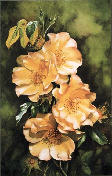
‘Laura Alexander’ Watercolor painting on Arches hot pressed 300gsm watercolor paper (560mm x 360mm)
There is a beautiful story behind this rose that I would like to share with you. Last year I was approached by TVNZ to paint this very special rose. The feature was part of a ‘wish programme’ called “Kev Can Do”. Julie Mckinnon wrote to Kevin Milne telling him of the sad tale of her two children who had passed away soon after birth from McKinnon’s syndrome (a syndrome named after her family). Her wish was that a rose be named after her two little ones, Laura and Alexander. Her wish was granted and I was asked to paint a picture of a rose that was chosen especially for this purpose as the rose wasn’t in flower at the time of filming. It was an incredibly moving story and throughout my painting, thoughts of Laura and Alexander influenced the direction of this image. I wanted it to glow – like a new dawn, but gentle as a child. I wanted soft, lost and found edges allowing the roses to emerge from the luminous background. I wanted a peaceful composition and one ideal for the remembrance of these two cherished little infants. The ‘spent’ flowers indicated the story of life, the buds were symbolic of promise. The petals of the roses are softly kissed by the dappled sunlight. It was a great pleasure for me to be asked to be part of this story and this painting expressed how deeply moved I felt by it.
Instructional Art DVD’s and Video Downloads
Click on any of the DVD images below to find more in-depth information on the contents of each of the DVDs and Video Downloads.
-

DVD: Watercolor Masterclass Volume One: “Painting Life-Like Leaves and Vibrant Greens” – for all skill levels
US$54.50 -

One-on-One Watercolor Workshops with Susan Harrison-Tustain – for all skill levels
US$54.50 -

Painting Watercolor My Way with Susan Harrison-Tustain – for all skill levels
US$54.50 -

Watercolor Portrait Workshop with Susan Harrison-Tustain – for all skill levels
US$54.50
