It’s all About Intelligent Composition
Did you know that no matter which medium you use, a large percentage of the success of the work, is determined before you put ‘paint to paper’? Surprised? It’s true. I’ll tell you why and how you too can create even more captivating artwork, so your paintings really do become fine art:
Two key elements in the success of a piece are planning and observation. Let’s deal with planning first:
I call this creating an ‘intelligent composition’. Without it – no matter how skillful you are with the brush/pencil, your painting will be all about technique and method. It will be missing an important ingredient. What you really want is to create a ‘feeling’ and an atmosphere – an emotion. You want your work to stand out from the rest and to captivate the viewers.
Whether we are watercolourists, oil, pastel or porcelain painters – we all strive to capture that illusive moment – you know the one…the moment when you spy the dappled sunlight illuminating an elegant rose, or watch it glisten as it touches a dewdrop. Whatever your subject, you can capture so much when you have taught yourself to observe.
Observation teaches you to take note of things you would otherwise overlook. For instance, have you seen that magical moment of wonderful expression – the one that shows years of wisdom on a characterful and aged face? That’s what we are talking about. Whatever medium you choose, there are a few things I can share with you that will help your art convey that special ‘je ne sais quois’.
Tip: Remember ‘pretty’ is ‘nice’ but ‘intelligent’ holds interest.
So how do we do that? You begin with observation, research, thinking and analysing. This of course all sounds very academic – but you’ll find that is not the case. What it is really about is revelation and opening your mind, extending your thoughts and challenging yourself.
We are all ‘champing at the bit’ to get started aren’t we – but lets take a little time to think things through before we get into the ‘flying brushes’ stage.
Things to think about:
Why do I want to paint this subject? What is it that touches me? What am I trying to say?
Most often you will find the answers to the above are the same for each question.
If you can’t answer these questions when thinking about the subject you have in mind – then spend a little more time studying the idea – or choose another subject or add something to the composition that gives it expression.
 Watercolor ‘High Summer’ 535mm x 477mm
Watercolour on Arches Hot Pressed Paper.
(Available as a lithograph reproduction print)
Maybe the answer to the above questions will be found in the light you choose to illuminate your subject. This can create a feeling, and atmosphere. For instance: the subject may be gently emerging out of translucent shadows, creating a nostalgic mood. Or it could be something totally different – the subject may be in dappled sunlight creating a warm summery feel. Or you may want to feel the warmth of the summer sun through all seasons, and enjoy the gentle breeze as it wafts amongst the pansies in my watercolour painting titled ‘High Summer’
Now let’s analyze:
You’ll find your subject will lend itself to a composition and often an era.
Take old-fashioned roses for instance: A vase of David Austin Old English Roses lends itself to a by-gone era. Why not emphasise that by placing them in a situation that adds to that notion – as you see in this oil painting which was hugely popular in my recent exhibition:

‘Last Lingering Note of Summer’
Oil painting on Canvas 512mm x 410mm.
(Available as a fine art giclee on canvas reproduction print)
Notice how I have used luscious and also delicately coloured roses in this composition. I chose to place these on a richly coloured marble table top. See how the old glass vase allowed the translucent background to act like a foil to the green, crimson and brown flower stems. I wanted the translucent background shadow to envelop the roses as they emerged into the daylight.
Without thinking about it – you can ‘feel’ the era of this painting. You can imagine a high window allowing a shaft of light to spotlight on this rich and luscious bouquet. But now I will break the spell: In actual fact this vase of roses was placed in my living room, on a table with a black cotton cloth. There were no luminous shadows in the background or richly grained marble tabletops. But you can see how I used these ‘supporting tools’ to bring out the essence of what I wanted to say.
So now you are thinking about narrowing down the ‘essence’ of your subject. Now all you have to do is decide what this ‘essence’ is – and then emphasise it.
Here is another example of finding the character of your subject – this time it is texture:

‘Old Rambling Rose’ – Floral Painting – Watercolor on Arches 300gsm hot pressed paper
The crinkled petals of this exquisite rose “Adelaide de Orleans” remind me of crushed silk. I wanted to create this texture so I studied what it was about the translucency of the petals, the folds, the highlights, the ridges and the subsequent cast shadows. Before I began painting, I noticed the shadow edges were soft – not hard or crisp. I loved the way the stamens cast wonderful soft shadows across the petals and leaves. I could use these shadows to give great dimension to the work. I’ll show you what I mean:
Put your finger over the stamen shadows of the spent rose (on the leaf at the left-hand bottom of painting) so that these shadows are blocked out. Notice how relatively flat and close to the leaf this spent rose looks. Now lift your finger – and voila! See how the stamens pop up and look much more pert – and more importantly – see how they create a wonderful reality and depth to the work!
Now all you have to do is emphasise these things; the illusion of silk, the softness of the shadows. Make use of any opportunity to bring three dimensions into the composition. Divide the leaves up by placing a cast shadow from a stem, for example, as you see on the leaves just above the right hand, middle. These things describe the character of this rose. I love to hear viewers of my work recognise which rose each painting is depicting! You will too.
I seldom have time to give classes these days. Although I do have my arm-twisted from time to time! I have now produced two hugely successful instruction videos ‘Glorious Garden Flowers in Watercolour – the essential techniques’ and ‘Susan Harrison-Tustain’s Watercolour Workshop – watercolour breakthroughs’ – and of course there is also my best selling US published book too: ‘Glorious Garden Flowers in Watercolour’. North Light Books, Cincinnati.
My teaching philosophy is not to say “do this – do that”. I believe teaching is like leading someone to a window, throwing it open and allowing them to discover their own artistic journey. I do this by allowing my students to become aware of the endless possibilities of each method and technique. Let me explain: We’ve just talked about a rose petal being like crushed silk. Let’s take a look at ‘Jonquilles Pour Ma Mere’ – Translated ‘Daffodils for my Mother’:

‘Jonquilles Pour Ma Mere’ – Watercolor on Arches 300gsm hot pressed paper (380mmx210mm)
(Available as a fine art giclee on watercolour paper reproduction print)
Notice the folds in Sarah’s gown? They are created using exactly the same methods as we used to create the rose petals. Observe the similarities.
Now let’s take a look at colour:
See how the colours in her dress glow with orange, yellow, cream and purple. And yet the dress still “reads” cream. This vibrancy is very appealing and lifts the composition. The use of complimentary colours placed next to each other have created that wonderful feeling of the late afternoon warm sun illuminating and glowing through the fabric. The complimentary colours dance. Complimentary colours? Not sure about them or how to use them? It’s easy – just follow this guide, observe how well they do their job in my paintings and you will be hooked on them too:
Complimentary colours:
Red – Green
Green – Red
Orange – Blue
Purple – Yellow
Yellow – Purple
Tip: Should you forget, there is another way to refresh your memory until the complimentary colours become second nature to you:
You will already know we have three primary colours:
Red, Yellow and Blue.
Now take any two of those three primaries – for example let’s take Red and Yellow. Mix them, and we have orange. Now what colour (of the three primaries) is left? You have used Red and Yellow – so the colour that is left has to be Blue. Now that colour – Blue – is the complimentary colour of Orange.
The theory is: Mix two primaries and the colour you have left is the complimentary.
A little confused? Let’s take another example:
Let’s take Yellow and Blue this time. Mix them and what colour do you get? Of course – you’re right – we get Green. So, of the three primaries – we have used Yellow and Blue to create Green. Which colour of the original three primary colours are we left with? That’s it – we are left with Red. So it follows that that Red is the opposite of Green. And of course vice versa as in all cases.
Finally lets look at mixing the last two primaries: Red and Blue. What do we get when we mix these? Yep – purple. You are on to it! So which primary colour are we left with…yellow! Yellow is the complimentary colour of purple. Yes! You’ve got it!
Tip: Instead of using tube black or grey – use the natural complimentary colour as we have discussed above, to describe your shadows. I like to use a little of the ‘local’ colour and then add some of the complimentary colour to create realistic and natural shadow colours that glow and dance.
I imagine you’ll be wondering about my definition of ‘local’ colour. It’s quite easy really – if you are painting a Green leaf – then Green is the local colour. So take a little Green ‘local’ colour and add some complimentary colour to this. (you’ll have worked out from the above formulae that the complimentary colour of green is? ….Red – that’s right! ) This will give you a luminous but greyed colour – just ideal to describe your shadows.
Tip: Another excellent idea is to vary the colours in your shadows. A shadow that is full of colour is lively and vibrates with the surrounding local colour.
Have a look at my painting ‘All Aboard’:
‘All Aboard’ Watercolour painting on Arches Hot Pressed Paper 300gsm (660mm x 390mm)
(Available as a fine art giclee on watercolour paper reproduction print)
See how the shadow on the floor is not a solid mass of grey? I took the local colour of the floorboards (these were initially painted as if they were without shadow). The local colour was really a variety of colours; a brownish, orangey, yellowy colour – with a light wash of green to neutralise them. To this combination of local colours I added a variety of complimentary colours. Blue – to balance the orange, purple to balance the yellow and a touch of red to balance the green. Notice how I ‘favoured’ these colours in different areas of the shadow colour – how I allowed each of these colours to dominate in areas. See how this made the shadow glow? The shadow colour on the little lad’s shirt was described using varying depths of orange and orange-yellows. See how this combination made his shirt come alive.
Now just for something totally different, with an Australian/New Zealand flavour:
Lets look at ‘On Active Service’ – almost a monotone painting:

Watercolor painting ‘On Active Service’ – on Arches 300gsm hot pressed paper
This painting is one of those images that I needed to paint. A tribute to our ANZAC servicemen and also a tribute to those at home. The news of the day is symbolised by the New Zealand Herald as it sits on the breakfast table alongside a much-welcome cheery letter from a serviceman. He has just been given his stripes and he describes his surprise in his letter which has the letterhead “On Active Service”. This is an actual letter and a photograph of the serviceman. Notice how the photograph is not new and pristine. It is much-loved and time-worn. The letter itself is very readable and the glasses magnify the words in their lenses. A different perspective – we can appreciate how news from our servicemen must have been treasured insights into the day to day happenings in the regiment. This serviceman returned home to his family and the items you see here are of course treasured as they were then. They were generously loaned to me … which was much appreciated.
This painting is full of symbolism and has a truth and honesty that I needed to portray. It was important that the viewer enjoyed the excitement of the news too, so I had to write the words just as they were. In “fair dinkum kiwi/Ozzie”. A joy to read! See how I have used green and red and blue in the shadows. This counterbalanced the brown/ecru/orange subtleties of the main subjects. (I hope the colours reproduce well for you to see).

‘Qualcosa di Vecchio, Qualcosa di Nuovo’ – translated ‘Something Old, Something New’.
Watercolour on Arches Hot Pressed paper 300gsm (610mm x 255mm)
(Available as a fine art giclee on watercolour paper reproduction print)
There are so many hints and tips that I could tell you – but space has almost come to an end. Let’s just take a quick look at ‘integration’. Your main subject needs to be part of the scene. See here in ‘Qualcosa di Vecchio, Qualcosa di Nuovo’ how this gentle hollyhock looks part of the scene. It does not have the look of a ‘cut-out’. I have created this impression in the final stages. When the flowers were complete, as was the background, I layed in a final glaze/wash of transparent background colour and brought it up and over, onto the petals. This softened the edges and gives the impression that the background colour is softly bouncing onto the petals – tying them in and making them part of the scene. In paintings with a darker background you can use the same principal but in that case you would create lost and found edges as the edges of the petals melded into the shadowy depths. It is magical how these things create a naturalistic realism that breaths life into a painting.
You can create all of this too – it’s all about observation, observation, observation, emphasise, emphasise, emphasise and let’s not forget what is most important: intelligent composition!
Remember what we want is ‘meaning’ – a reason for being. Create a story – paint silent poetry.
You don’t want to just paint the skin of a person – you want to paint the character! We want ‘soul’ – not just a good rendering. You see – even the words ‘good rendering’ sound bland now – don’t they!
I wish you all well with your creations. My philosophy is “Paint from your heart and you will fly”!
Happy Painting! – Susan
Instructional Art DVD’s and Video Downloads
Click on any of the DVD images below to find more in-depth information on the contents of each of the DVDs and Video Downloads.
-
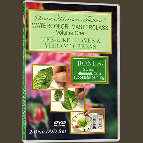
DVD: Watercolor Masterclass Volume One: “Painting Life-Like Leaves and Vibrant Greens” – for all skill levels
US$54.50 -

One-on-One Watercolor Workshops with Susan Harrison-Tustain – for all skill levels
US$54.50 -

Painting Watercolor My Way with Susan Harrison-Tustain – for all skill levels
US$54.50 -

Watercolor Portrait Workshop with Susan Harrison-Tustain – for all skill levels
US$54.50
