WELCOME TO MY FREE ART LESSON: The Power of #Color
This is a short series of #freepaintinglessons where you will discover invaluable, powerful insights into #painting!
Today’s #lesson we will begin talking about The Power of Color. #Color of course is a huge subject and we will touch on some of the other aspects in future posts. But for now – let’s begin with just one of the great revelations I discovered on my journey. It was a light bulb moment! I hope many of the posts I will make will become ‘light bulb’ moments for you – just as they were for me too!
THE POWER OF COLOR! HOW TO USE COLOR TO CREATE DISTANCE AND DIMENSION.
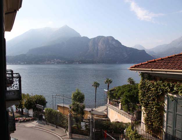
Photograph of Bellagio, Lake Como Italy. A great example of how to create different focal planes in your paintings.
Did you know that the colors you choose can determine whether you will create a successful painting?
Color is color. We often think the term means rich bright ‘color’! But in fact that is a general perception. But for artists, the word color, means a multitude of things: It may be bright, vibrant, dull, muted. Learning to #understandhow you can push / pull the objects in your painting – forward or back – by using color and #intensity of color is a powerful #skill to understand and use. Understanding a little more about the power of color can bring that professional edge to your work!
One aspect of a successful painting is determined by how well you understand the impact color can have on where your subjects sit in your #composition.
This is what we will discuss today. I hope it opens your awareness of such things and how you can be totally in control of how successfully you use color to capture ‘the moment’, the #emotion and the #atmosphere you wish to portray.
Let’s start with some facts and then follow those with examples to enable you to clearly see the power you have in your #brushes!
A simple #fact to remember:
White and very light colors – and warm, intense colors generally advance in a composition.
Dark, cool, muted colors recede.
NOW HERE IS WHERE YOU CAN PARTICIPATE:
Take a look at the photograph above. This isn’t a great photograph – but it is an excellent example to demonstrate the revelations I want to share with you.
When I look at a potential painting subject, I spend some time deliberating. I look closely at the elements in the scene. In this case I would look at what is in the foreground and compare that with the distance. I would ask myself:
- How would I create a true sense of distance and perspective in this scene
- What am I looking at
- How do I know which mountains are closer and which are more in the distance
- How has nature given me the impression of foreground/background
How would you go about creating a convincing impression of distance in this scene?
The answers are all in the photograph (or in nature if you were standing there!)
#Nature’s ‘recipe’ that we need to capture this magic is always right there – before us! We just need to learn to interpret, understand what it is that we are seeing.
I want to help you see the answers – and understand them.
Color and Intensity
These are your guide.
Can you see how there is a marked difference in the intensity and warmth of the foreground #colors – when compared to those in the mountains over the other side of the lake?
You know there is green grass on those mountains – but you can’t see it can you?
You know that little village across the lake will how beautiful #reds and #blues, #yellows and #oranges as well as #greens. You can barely make see these colors from this distance. However you can see it more than you can see the green of the grass that is on the mountains.
Have you noticed that as the mountains recede further into the background, they become lighter and cooler in color. (closer to blue)
As subjects move further into the background – the warm colors disappear. Can you see how the warm colors completely disappear?
Tonal value also becomes less and less obvious as a subject moves into the distance. #Tonalvalue is measured in light and dark. Think of it as a scale of grey – from #white – to black and everything in between.
Let’s get back to color: If we place a warm intense color in the background amongst the village – it will command attention and draw the eye to that warm intense spot that will be totally out of place. Depending how the warm intense spot compares to the surrounding color and intensity – the viewer of that painting may not necessarily realize what is wrong – but they will probably be aware something is incongruous in this scene.
Let me tell you what is happening when we put a #brightred spot in the distance:
The warm and vibrancy of that red spot will fight to come forward in the composition. Take a look – you will see what I mean:

The power of color. Can you feel that warm color fighting to come forward. It is warmer that the closest foreground so it is more dominant than the foreground colors. Squint and you will see what I mean.
Now let’s look at the original photograph again. Can you see how there is a marked difference in the intensity (saturation) and warmth of the foreground colors? Can you see there is a great tonal value range too when compared to those in the mountains over the other side of the lake? Tonal value – refers to the range from light to dark – highlights to shadows.
As the scene recedes into the background – the color range, #colortemperature range, the #tonalvalue range and the range of intensity all becomes much more narrow.
In other words as the scene recedes we don’t see the same variety of colors, warm and cool hues, #light and darks, rich color and dull colors (intensity/saturation). Everything seems to have a much narrower range doesn’t it? THESE are the things that allow we artists to create a magical sense of distance in our work.
Do give some thought to these things. Compare the #foreground with the background. Look at the light colors in the village across the lake. Can you see any? There aren’t any. But look in the image below what happens when we place one of the light colors that I have selected from the wall in the foreground village. Can you see how the light spots fight to come forward and sit on the same focal plane as the same light color in the foreground.
Imagine this: at the moment we have spots. They could be flying orbs! They appear to sit in the air don’t they. Obviously they are not the right color, tonal value or intensity we would use if we wanted to paint something relatively light in the far distance. You can clearly see what happens if we did. At the moment they look like orbs as I mentioned. Imagine if I had painted the impression of a house in that light color and tried to place it in the village across the lake. We may forgive flying orbs – but flying houses would be way out of kilter with this scene.

The Power of Color. Can you see how the light spots are fighting to come forward?
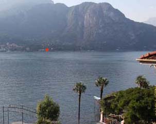
A bright red house looks out of kilter with the color, temperature, tonal values and intensity values we see in the surrounding areas. Can you see how this warm red color fights to come forward?
So now you can see how color, color temperature, tonal value, and intensity can be used to push or pull your subject within your painting. If you have painted an area that is too bright and too dominant in your painting. Thinking about what you have just learned about the power of color – what do you think you could do to make it recede a little more into the background?
Yes! All you need to do is lay in a cooler colored wash over your subject. If you are painting in oils – lay in a glaze of cooler color.

The Power of Color. I have dulled the red somewhat with a cooler color to enable the house to still have tint of red – but it now sits so much more comfortably within the scene as the intensity of the red is in keeping with the distance of the building from the viewer.
You are in control of where your subjects sit within your painting.
Here is another example:
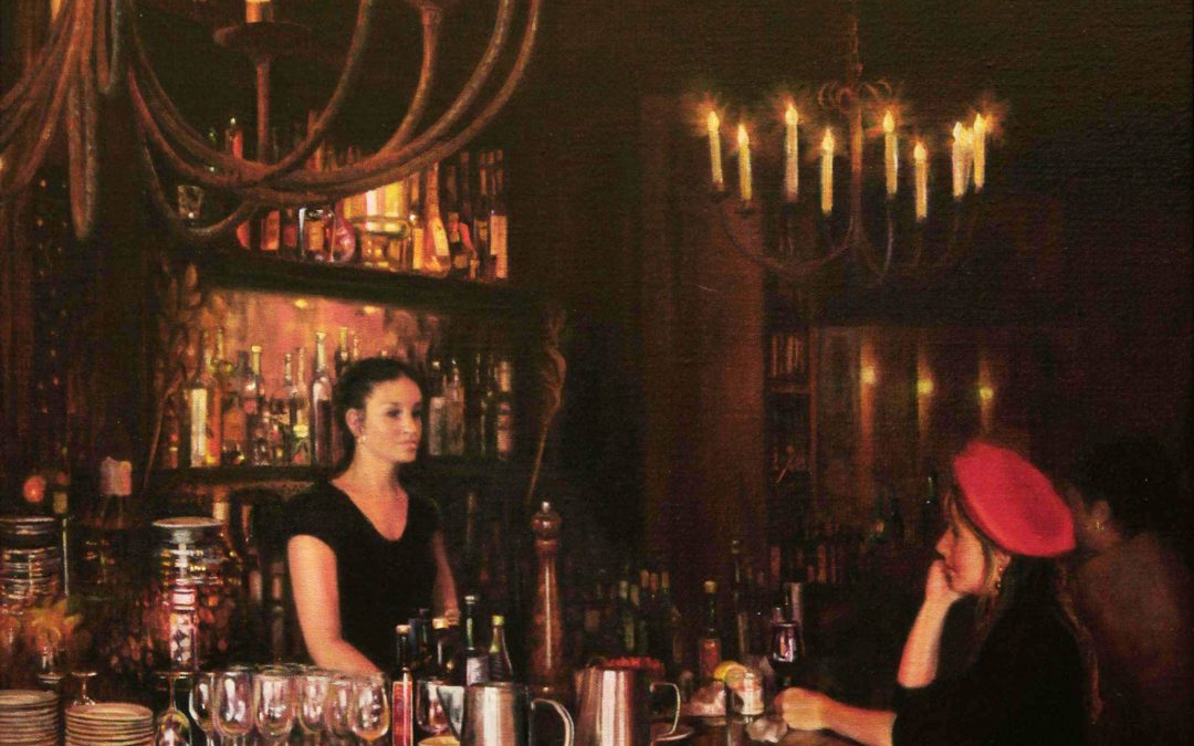
Le Confidente. By Susan Harrison-Tustain. Oil on Belgian linen.
Take a look at how I have pushed some areas back into this cafe scene. I have used a shadow color to allow me to guide the viewer to the main focus I wish to portray: the conversation between the girl and that waitress.
To enhance this focus, I laid a subtle fine veil of #shadowcolor to dull down the empty table at the front of the composition. I also laid in a fine veil of shadow over the chandeliers in the distance – which allows the chandelier at the front to glow even more brightly.I dulled down the brightness of the wall lights in the distance, the other patrons, and most of all – the plates on the left hand side of the top of the bar – and also the distant bottles at the far end of the bar on the right hand side beyond the patron. I used varying degrees of shadow mixes – some very fine veils and in some areas I used much stronger shadows colors. This allowed me to control how much attention each area receives. It helps me to guide the viewer to the areas I most want to focus on and these dominant areas are the reason for the painting’s existence. These hold my message.
What do you think would happen if I allowed all areas to remain in a similar light and have the same amount of vibrancy? Yes of course – the painting would be cluttered. The viewer would not know where to look first. By controlling the path of viewing – you can gently lead the viewer from the main subject and then into the other areas in order of importance. This can often delight the viewer as they slowly become aware of new and exciting areas they were not immediately aware of. For instance, take a look at the wine bottles at the far right of the patrol. Can you see they are just a suggestion of bottles, tucked away beautifully within a shadow. On the left hand side of the counter top you can see an array of plates etc. They are a #stilllife painting – just in themselves. But I could not let them dominate or they would easily have fought for centre stage. A light shadow over these allows them to support the main subject – but delight the eye as the different rich slightly subdued colors and surfaces have a restrained sparkle. Compare those with the glasses, silver jugs and bottles that are a little less in shadow and are closer to our main subject. You will see the tonal values are wider, the color range is wider, the intensity is greater. But with one stroke of my brush and shadow color, I could easily make them less noticeable and this of course would make my two models much more dominant.
YOU HAVE ALL THE POWER
Hopefully you can new see how you have all the power. The power comes from understanding not just how to use your brush and what methods you use to put paint on paper or canvas. What is equally if not more so important – is how you take control of color and all it’s attributes. It is so easy to understand once you are aware of the possibilities.
HOW BEST CAN I RETAIN THIS INFORMATION?
The best way to retain what I have discussed here is to try these things for yourself. Keep it simple. Why not create a painting of two apples or two circles for instance. Watch the magic as you make one of them recede with a slightly cooler color.
A great shadow color can be mixed with a tiny amount of these three colors:
Phthalo Blue, Phthalo Green, Antharinoid Red (Daniel Smith) or Alizarin Crimson
You can easily create a cool shadow by allowing the blue or green to dominate the mix above.
You can create a warmer shadow color by allowing the red to dominate (this is generally my personal favourite – I prefer slightly warmer shadows to cool shadows).
Use fine shadow washes or glazes initially until you feel you get the degree of distance (or dominance) you wish to create.
There are other colors you can use to make a subject recede:
A very pale wash or Alizarin Crimson will push a subject back just a very little amount. This could be exactly what you want. The reason this works is because Alizarin Crimson (caution Alizarin Crimson can be a fugitive color) is a slightly blue red. The blue that it naturally in Alizarin Crimson will help it recede. You could also use Purple Magenta. Naturally this has more blue.
Be sure to try fine veils of color initially.
You could use blue alone to push something back – but it will look unnatural
You can also use green. Green has blue in it of course. Once again – be careful as you don’t want your shadow to be too blue or too cold. It will look unnatural.
I generally prefer to use the #shadowmix I mentioned above.
CONCLUSION:
There is so much I could share. I wish time would allow me to do that. But space is also a problem So far I have been sitting here for over 4 hours creating this post. It is my pleasure to help you and I look forward to sharing just a few more gems that I hope will be light bulb moments for you on your painting journey.
Naturally the best way to learn is to see me painting in action! My workshops and my 2 disc DVDs and downloads allow me to share all I know about painting with you. They are full of learning as well as teaching you to understand why and how my methods and techniques and all I teach works. I teach all the breakthroughs and the lightbulb moments that revolutionized my painting career.
Click the link below to find free video previews and see snippets of some of the invaluable lessons you will learn in my #watercolorDVDs and #videodownloads. When purchasing any #paintingDVDs or #howtopaint #Video #Downloads from my website, you will also receive a fabulous free e-album full of inspirational photographic subjects that you may like to paint. My DVDs and Video Downloads are designed for artists of all levels.You will also see any special offers on my DVDs and Video Downloads HERE.

Learn all Susan knows about painting in watercolor in her four DVD and Video Download titles. For all skill levels from beginners to advanced. These internationally best selling DVDs are 2 disc DVD sets with over 3.5 hours of teaching, learning and invaluable breakthroughs and #lightbulb #moments to help you fast track your painting skills and career.
You can read all about my highly awaited fun international #workshops that are attended by artists of all skill levels from many countries around the world. You will find in-depth information HERE.
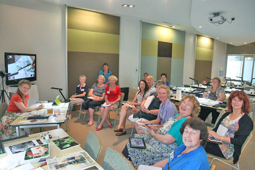
Susan Harrison-Tustain Sunshine Coast, Australia Workshop.
My #Facebook Page would be an excellent place for you to post your comments as well as your painting examples showing how you have used the lessons above. Feel Free – I know everyone would love to see what you have learned! It would be fabulous to share what you have learned in this short series of lessons with other artists around the world. Do invite your friends to join in too. This is going to be a fun interactive short series of ‘light bulb’ moments I want to share with you and your artists friends and family
I welcome your related posts and comments on my Facebook page. Don’t forget to like, comment and share so others can enjoy this series too:
Here is a link to my Facebook Page for your posts:
https://www.facebook.com/Susan-Harrison-Tustain-Artist-172467649443935/
Have fun! This is just the beginning!
Susan Harrison-Tustain
SusanArt Studios
www.susanart.com
Instructional Art DVD’s and Video Downloads
Click on any of the DVD images below to find more in-depth information on the contents of each of the DVDs and Video Downloads.
-
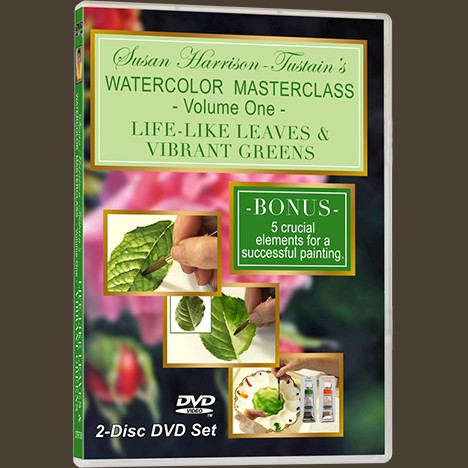
DVD: Watercolor Masterclass Volume One: “Painting Life-Like Leaves and Vibrant Greens” – for all skill levels
US$54.50 -

One-on-One Watercolor Workshops with Susan Harrison-Tustain – for all skill levels
US$54.50 -

Painting Watercolor My Way with Susan Harrison-Tustain – for all skill levels
US$54.50 -

Watercolor Portrait Workshop with Susan Harrison-Tustain – for all skill levels
US$54.50
